Branding and
supporting materials
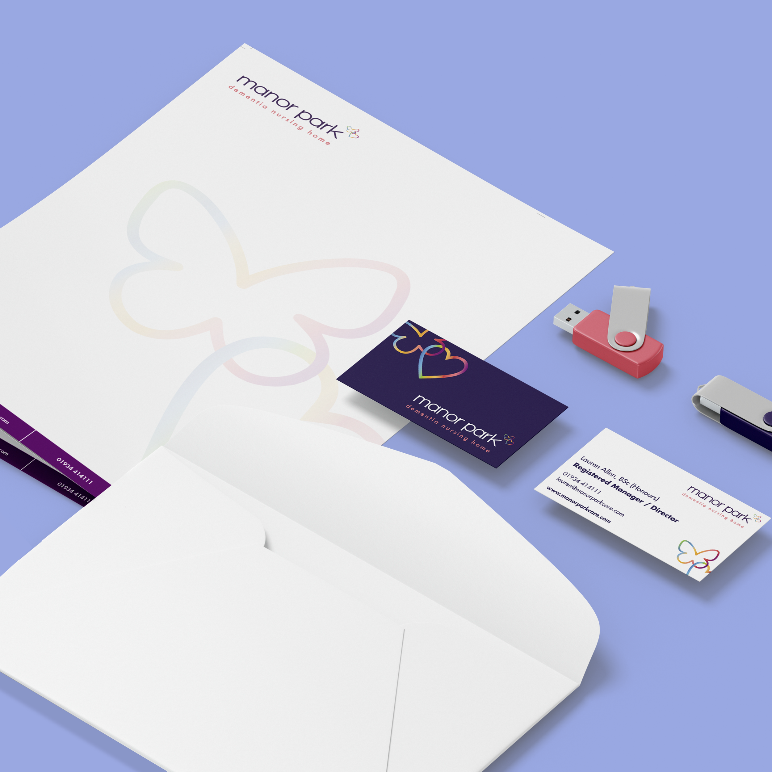
Redesign of logo and promotional materials alongside photography.
Brand redesign for manor park nursing home with a focus on dementia patients
A redesign of the brand for manor park nursing home was undertaken with a specific focus on designing for individuals suffering from dementia.
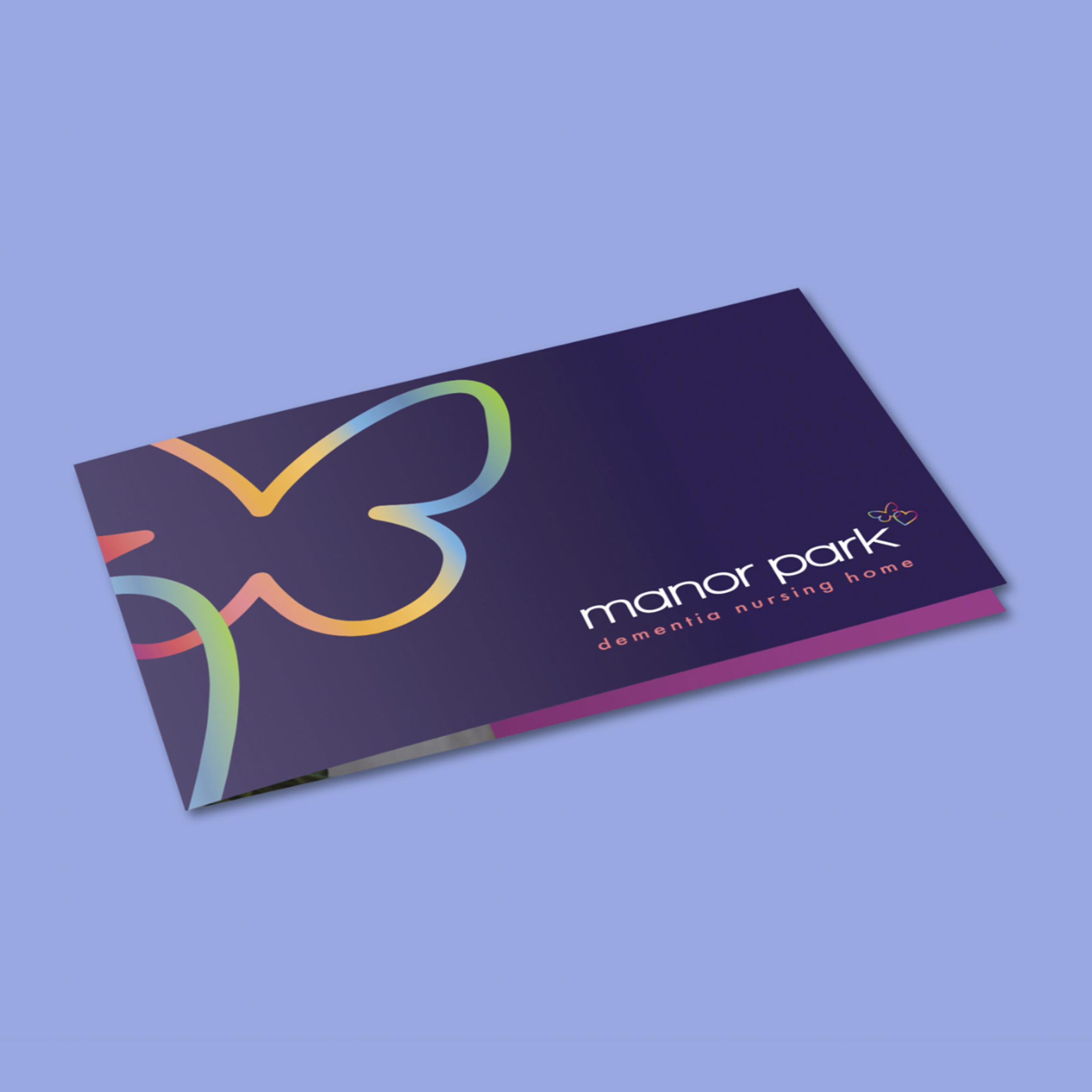
The client was firm in use of multiple colours and symbols. I carefully listened to their reasoning and worked with them and the residents to create something that they desired, which also maintained credibility.
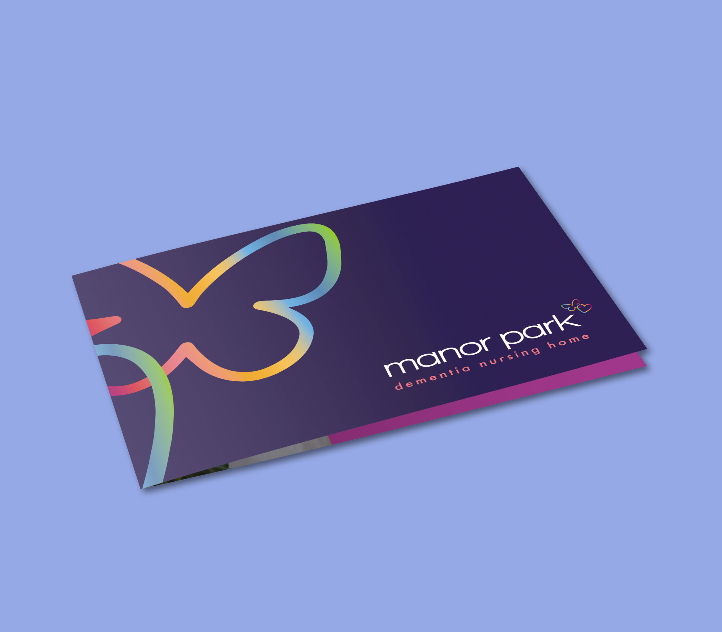
The design elements, such as lowercase fonts and bright colors, were chosen by myself to cater to the needs of those with dementia, as these features are easier for them to see. The butterfly is a significant symbol in the dementia community and an important feature for the client. I combined the butterfly with a heart, representing care. These elements reflect the main aspects of manor park, which I was able to incorporate as visual references in the brochure.
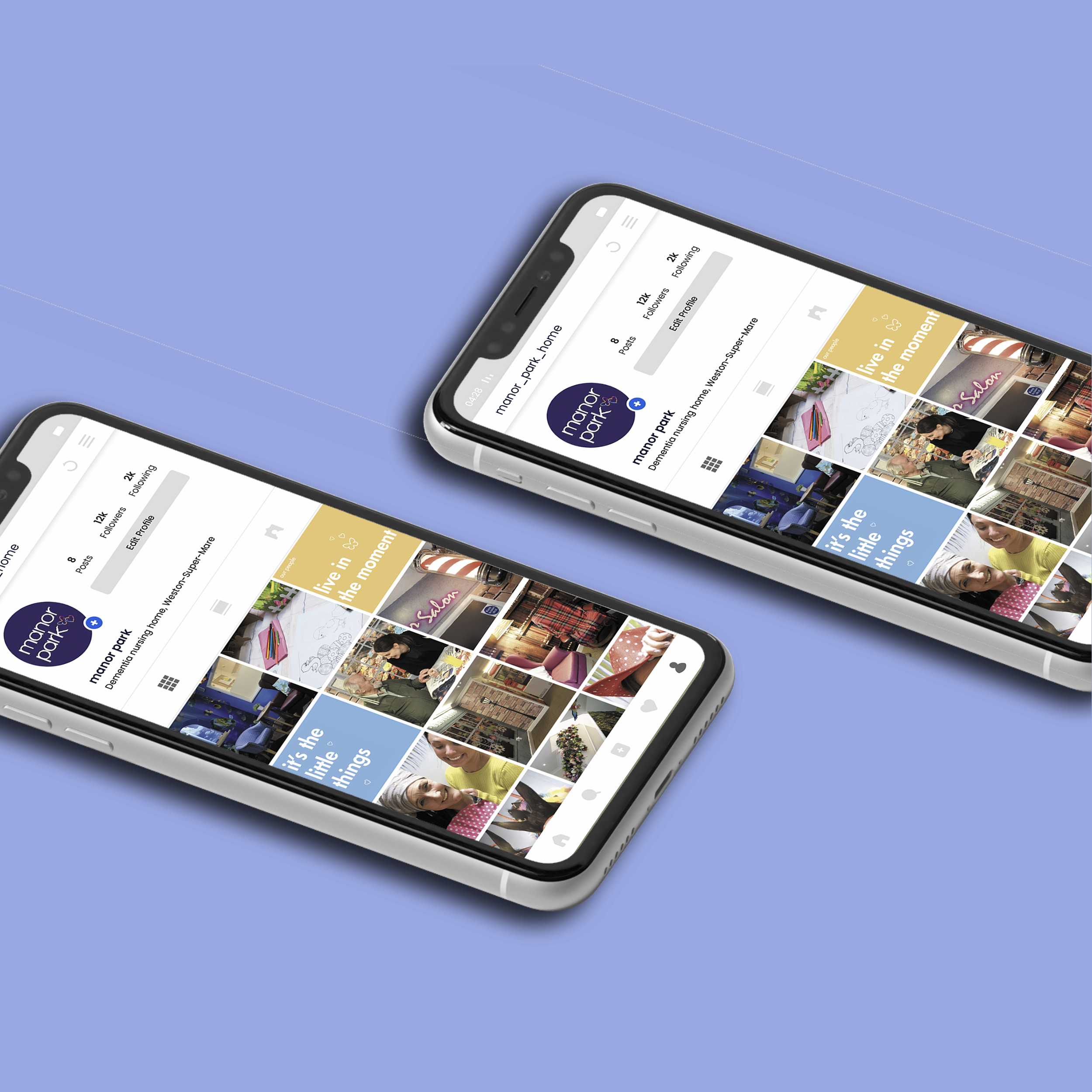
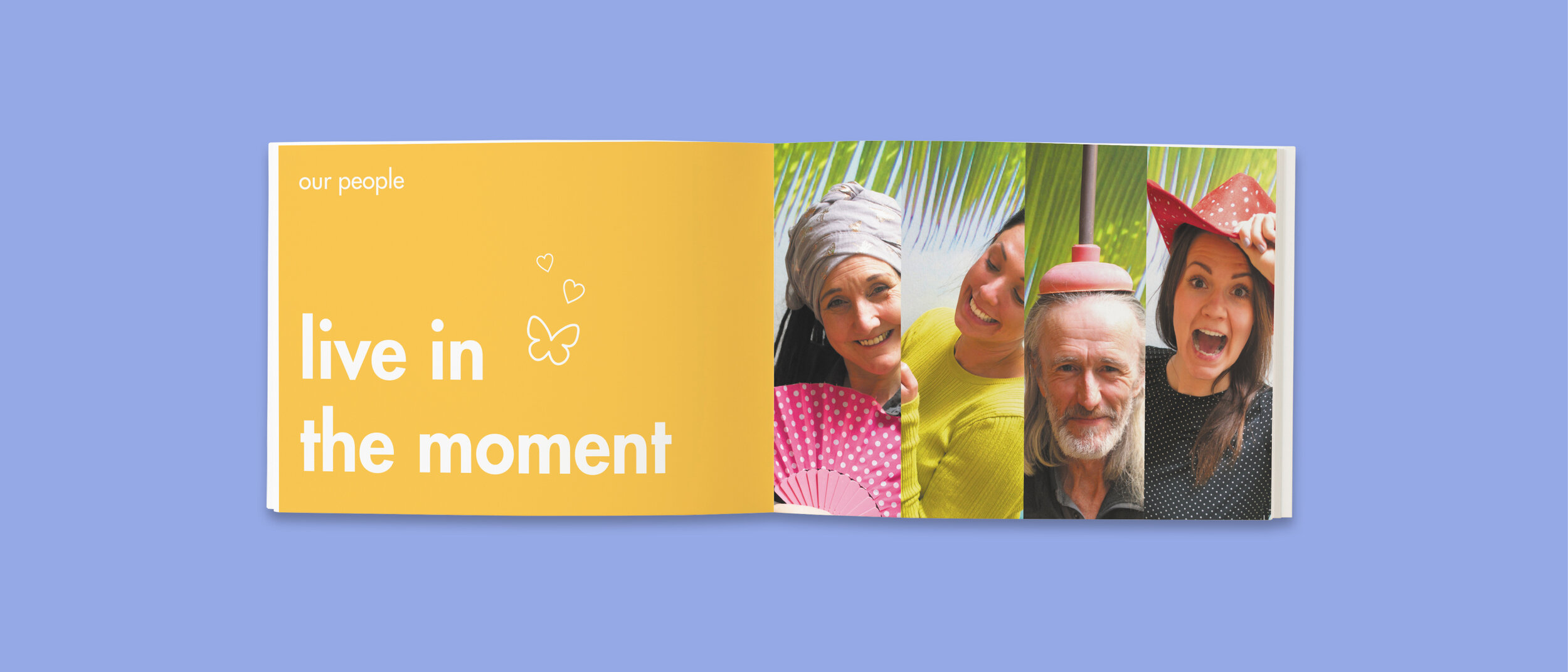
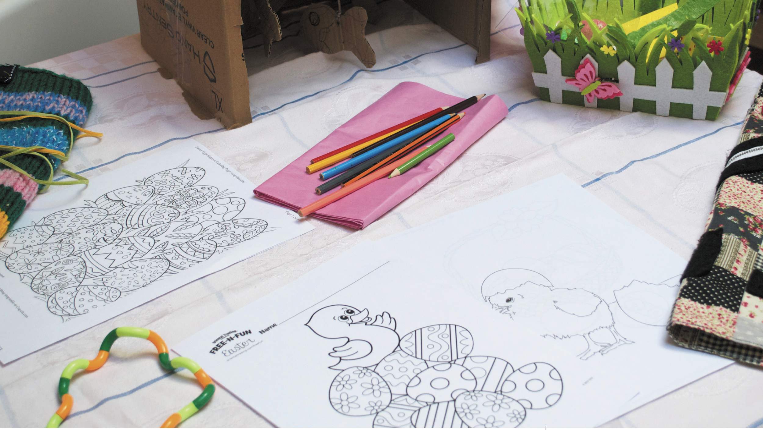
Additionally, I photographed supporting imagery to enhance understanding, particularly in brochures and internal communications.
The goal was to create a welcoming and cheerful environment for residents, achieved through the use of suitable photographs and vibrant colors in the branding materials. Brand guidelines were also developed to ensure consistency in communication.
